
Marina Rodil Aka Lila Garamond is an argentine graphic designer who works principally in London, Argentine and Mexico and Spain, she performs publishing, magazines guides, branding, editorial work, corporate image and producer of content for sites and publicity, she is a freelancer and actually you can find her for booking in Domestika or his own web site marinarodil.com, even the site is some neglected is really easy contact her by his telephone number that the site provides.
She has worked with Campari, Smart Box, Camper, Icon, Ray Ban and BMW, you can review his portfolio in her website.

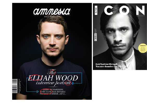
Marina preformed this cool and success two magazine covers for Amnesia magazine with Elijah Wood in 2015 and with Icon magazine of Prisa, with Gael Garcia Bernal in 2014, she was in charge of art direction and production, photography by Xavi Sancho.
Following I will try to pull apart his excellent design…
Alignment.
In the first cover Marina choose a simple centered alignment for make more combination with the completely frontal photography of the model and distribute the in two groups aligned on the top and bottom, but in the second one is more interesting that she breaks the symmetry and nothing is balanced and is all around the space.

Proximity.
In this case she group and get close the related information and lead the attention of the viewer and puts away that groups to make space for the central image and focal point of the cover

Color.
In first cover she decided a color photography because the skin and eye color of Elijah Wood easily may allow contrasting with the background, actually makes contrast among them, his eyes with his skin, and this with his hair. In the other place she uses the black and withe photography for make the face of Gael Garcia wither, and then make more notable.

Contrast.
This could be the principle that she most enjoys, this would explain too many things, the composition seems like all decisions she took goes around the contrast between two or more elements. In the cover of Icon it is all about contrast, the suit contrast with the background and the shirt, the face contrasts with the background, actually the illumination over the face make contrast with all around, the golden circle globe with all design, and his hair with the background and the letters of Icon. In the Amnesia magazine she decided a color photography because the skin and eyes color of Elijah Wood is a natural contrast fount with the background and his own face, she just to make contrast with the color for the text in the shirt.

Repetition.
This is maybe the less important principle, just repeat in the first cover the typography for keep the two text elements related and the alignment with the title, and in the second actually she did not repeat no typography, color, size or alignment.
.
We understand better how the principles of design works naturally in a designer’s mind to flow, and she achieves a fusion and balance among them, that looks really simple but elegant, she puts too much emphasis in some principles and not too much in others.
